

YEAR IN REVIEW
An email send that gave Peloton users their yearly wrap up using dynamic data to deliver the content.
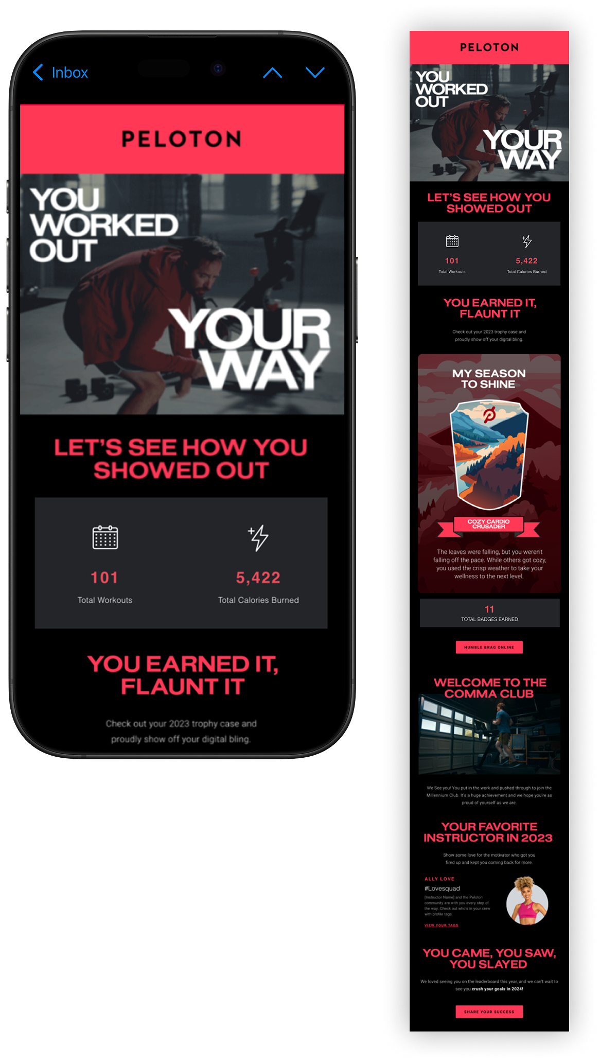
Year In Review
Each year, Peloton sends out their yearly user recap. In the past, the users have asked for specific information to be included. However, Peloton was unable to find the sweet spot on what data was most useful vs a good marketing campaign.
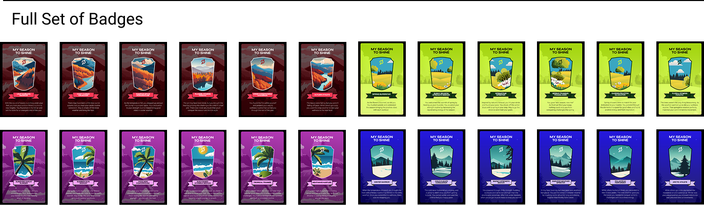
We pivoted the idea from doing just a data-heavy email to a piece where we used information collected from users. By setting up a robust if/else data filter, we were able to create an email that was able to personalize the “badge” to each user. Along with the badge, we input the instructor that user interacted with the most that year to create a more personalized experience. Overall, there were a total of 24 badges: six for each of the four seasons with custom copy and a slight change in the illustrations and 44 instructor modules .
We had an average open rate of ~65% and click rates of ~4.5%. But the highlight was that we had overwhelmingly positive feedback across social media channels and was well received by Peloton members.
My Role: Art Director
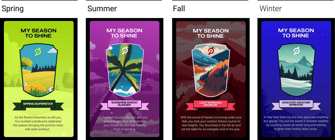
Badge Sets
The entire badge set that was sent to customers based on their shared workout data.