
UX IMPROVEMENTS
A cross section of web experience improvements that helped increase customer satisfaction, improve online bill collections, and better transparency about their TV services.
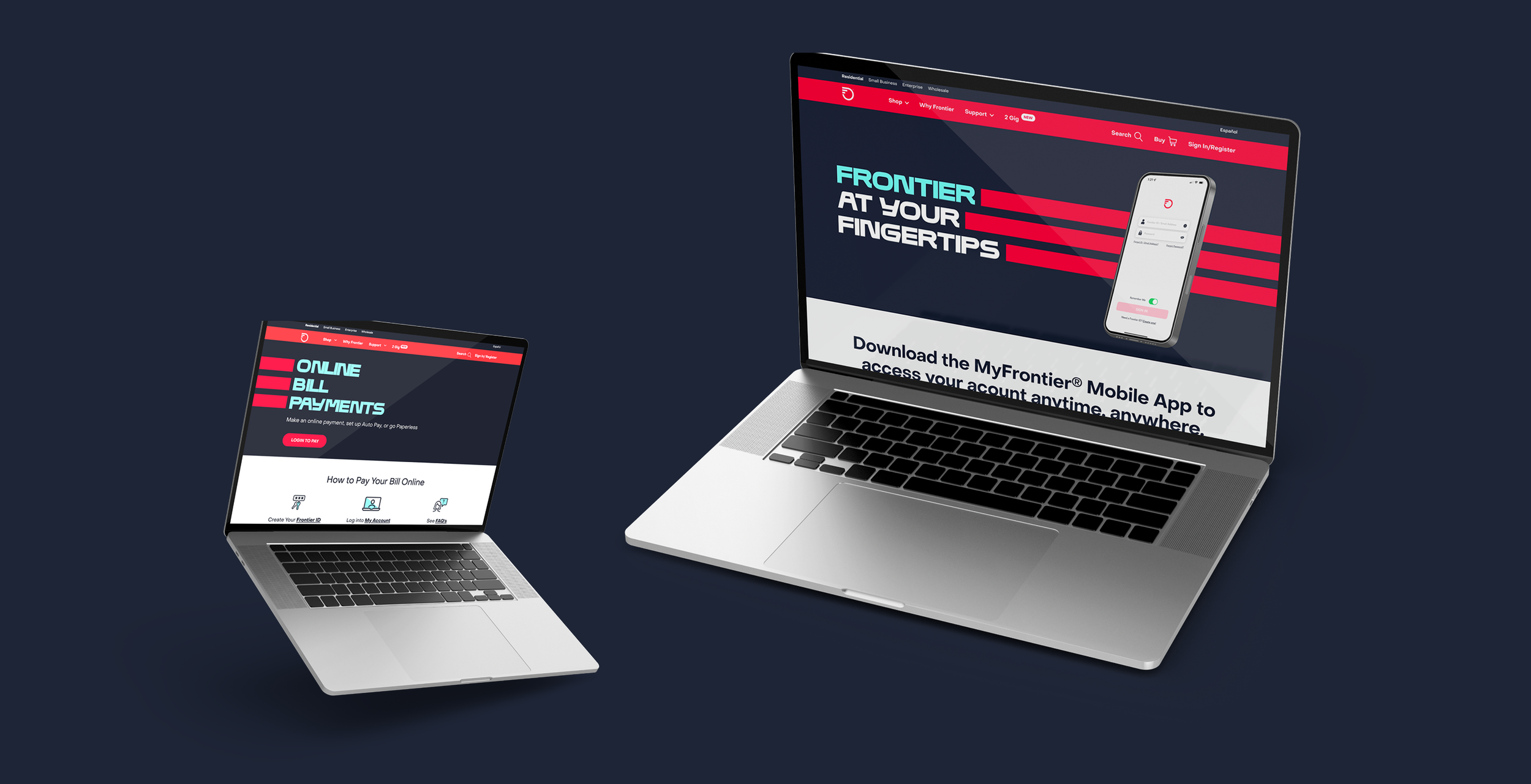
MyFrontier Mobile App Landing Page
With the redesign of the MyFrontier Mobile App, we wanted to showcase the new features on a simplified landing page. Customers had given feedback that the current landing page didn’t tell much about the benefits of the app, so we simplified the messaging and visuals to present a simple overview of the app. The results were an increase in app adoption, online bill payments, and calls to customer service went down with respect to questions about the app and the features.
My role: Creative and art direction

With the app redesign page, we leaned in on the online bill payment page as well. The original page was poorly designed and executed and customers were having a hard time making a simple payment. We reviewed the user feedback and performed UX testing to see what people found most useful. The results were a much more simplified page that ended up driving online payments up by 65%.
My role: Creative and art direction
Online Bill Payments Landing Page

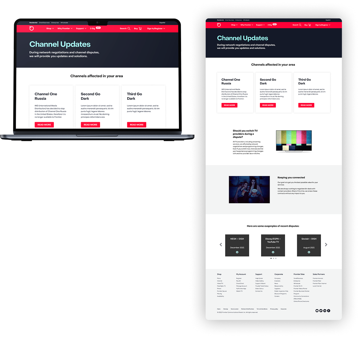
Channel Updates Landing Page
The Channel Updates page was there to inform customers on why a certain cable channel would drop from the lineup. The original page was a full microsite with far too much copy and content. We found the users would abandon the page after only a few seconds. That lead us to the hypothesis that there was too much for the user to take in and this was confirmed by gathering quantitative data that showed us there was a high level of user frustration. The redesign and simplification to a singe page was found to have a far better impact on the user understanding of why they were losing channels.
My role: Creative and art direction